20 examples of great Twitter bios to get inspired by

Your Twitter bio is like your business card on the Internet. If you are a creator, you’ll want to learn more about how to optimize your most precious advertising billboard online — your bio.

Your Twitter bio is where thousands of people who could become prospective followers will make a split-second decision about whether you are worth following.

There are a couple of fundamental constraints you need to keep in mind:

First: You don’t have a lot of space, so you need to make it count.

Second: There are thousands of Twitter bios out there, so you need to find the right way to attract interest with just the right amount of originality.

A solid Twitter bio is one of the fundamental foundations for running effective Twitter marketing.

It seems like it should be easy, right? Say who you are, and what you do, get a nice headshot and design a banner image.

In essence, that’s the canvas you have to paint with, but there’s an art to it!

Table of Contents

What makes a good Twitter bio

A Twitter bio is like a modern resume or CV for the social media era. You have 160 characters to convey who you are, what you do, and why people should follow you.

160 characters is not a lot, so you must make the most of it — with short URLs, emojis and creative approaches to using the allotted character limit to its fullest.

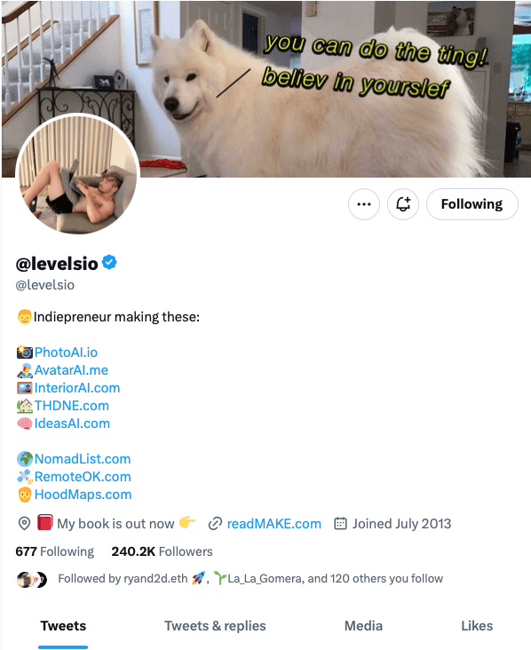
Here’s @levelsio, a famous indie solopreneur, making the most of the character limit:

pieter levels

You can see that he is maximizing the character limit by listing a series of projects. As part of his personal style, he’s not using the banner to be particularly serious, but conveying a meme-friendly, indie attitude.

Let’s take a look at another Twitter bio:

Steph smith twitter bio

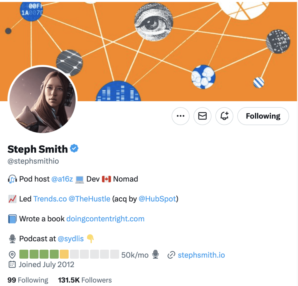
This a similar approach but with some more tweaks. Steph Smith is also using the character space wisely, with emojis and line spacing that allow her to show off her various main gigs and side hustles.

She’s also cleverly using a technique that is popular with indie makers and people who build in public: the revenue progress bar.

This is a clever example of how an economical use of the characters available can still convey interesting information. Steph has hijacked the “location” field to convey a different kind of information than just “California” or “Bali.” Creativity wins here!

Let’s look at one more:

Justin welsh twitter bio

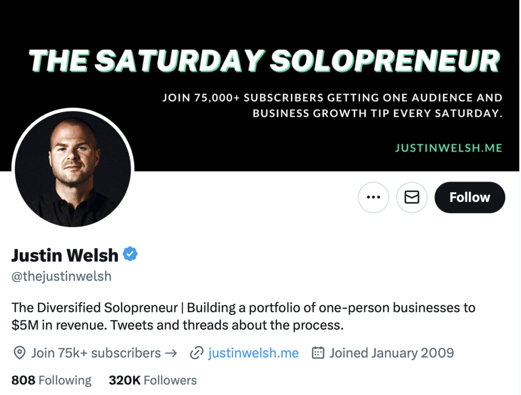
This is a more classic and direct approach — Justin Welsh tells you exactly what he does, displays social proof without being cheesy, and provides a clear profile headshot and unambiguous call to action in the banner.

Justin is less concerned with providing a jumping-off point or “link tree” for a series of projects and has an approach that is focused on bringing you in to his audience.

There is no one right way to do this — the only commonality that matters is to design with intention.

Whether you want to build emoji-driven graphical candy, or just get straight to the point with plain text — it all depends on what you are going for.

10 examples of inspirational Twitter bios

Let’s take a look at Twitter bios that are aiming for an inspirational approach — bios that communicate that the act of following these Twitter accounts will bring followers more motivational and authoritative tweets into the timeline.

Tony Robbins

Tony Robbins Twitter bio

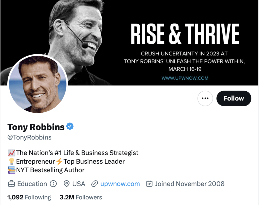
OK, so this first one is kind of cheating a bit. We picked the global public figure literally most known for self-promotion, inspirational marketing — someone who literally built a billion-dollar company off of a personal brand.

But notice that Tony is still using some of the same tips and techniques: accentuate text with emojis, tell people exactly what you do, use social proof, and be direct (and not overcrowded) with your banner.

Guy Kawasaki

Guy Kawasaki twitter bio

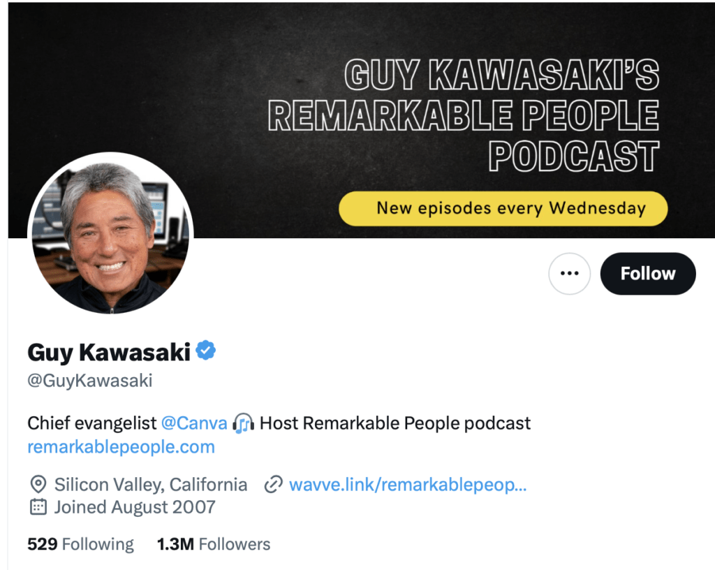
Guy Kawasaki has had an illustrious career, including working on the Apple Macintosh marketing team in the ’80s. In fact, I think what’s interesting here is what Guy is not doing!

He’s not trying to pack his entire bio into the space that he has. This is a great example of letting a high-quality, minimalistic banner design do the talking.

Guy is associated with a big Australian unicorn company, Canva, and has a weekly podcast he wants you to check out. It’s clear, simple, and makes you curious to learn more.

Andrew Huberman

Andrew huberman twitter bio

Dr. Huberman has an ace up his sleeve. Any time you can break out the Ivy League or FAANG credentials (or in this case, a PhD from Stanford), you are automatically dialed in with social proof. Andrew’s bio hits three points with concision and clarity of purpose.

Why should you follow me? I have the authority — I’m a Stanford professor.

What do I do? I host a podcast that you should listen to.

Why should you listen to it? To learn more about cutting-edge science and health information.

Codie Sanchez

Codie Sanchez Twitter bio

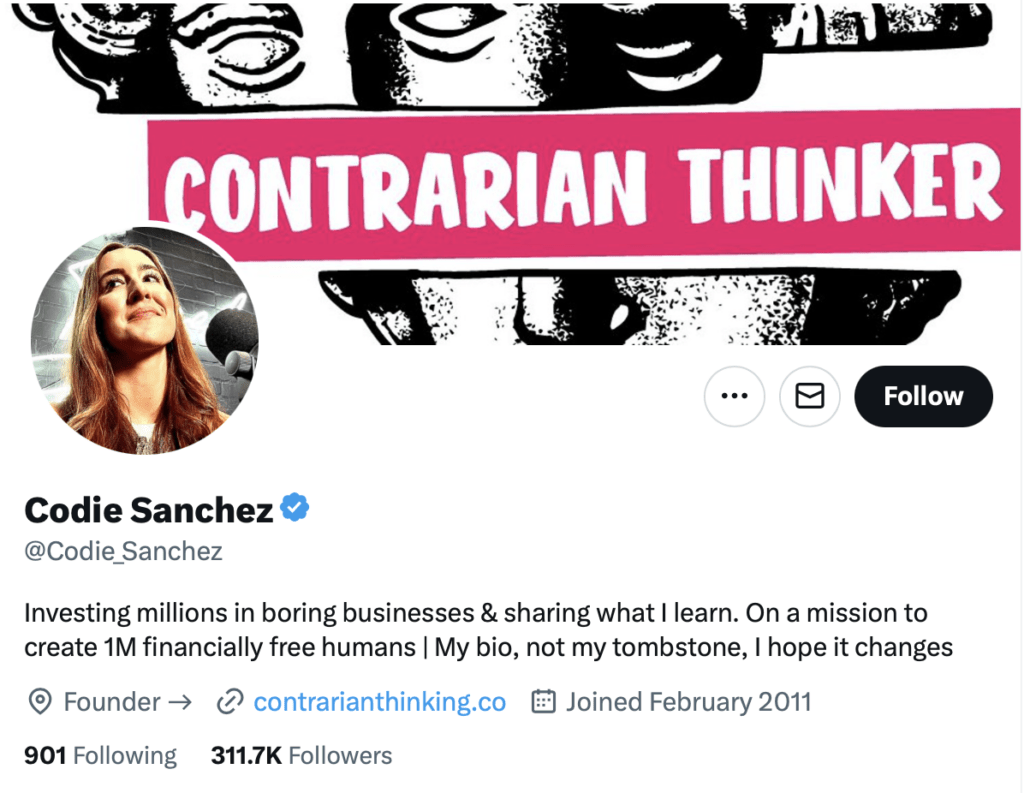
Codie Sanchez isn’t just a generic investor. VCs and angels (and wannabe VCs and angels) are a dime a dozen on Twitter. Codie invests in boring businesses.

She shares a magnanimous vision statement. You may not know exactly what “boring businesses” means — but it has got your curiosity that this is someone who will dive into businesses that are slightly outside of the typical Silicon Valley hype.

The banner reinforces that this might just be the first person to follow if the mainstream Valley perspective on what makes a good business is getting tiresome. Codie promises to talk about different kinds of businesses — maybe enough to inspire you to start one.

Alex Hormozi

Alex Hormozi Twitter bio

OK, including a 5-star rating emoji art is kind of funny, but it’s an example of using emojis to cleverly convey a positive connotation. Alex, like some we have seen before, takes a direct approach and tells you exactly what he does and where you need to go to find more from him (Acquisition.com).

He is extremely precise in specifying what kind of business advice/mentorship he is giving. It’s not a generalized guru stuff — it’s more precise: growth and M&A advice for profitable multi-million dollar companies.

He’s using the link field to drive people to his book, and previewing with his location field that the book won’t cost much (just a buck).

Ana Lorena Fabrega

Ana Lorena Fabrega Twitter bio

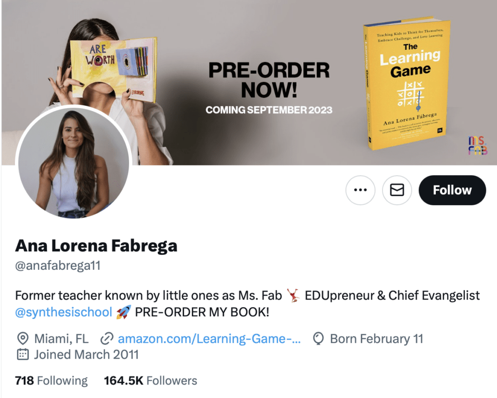
Ana is a great example of putting some specific effort into combining photography and graphic design for the bio.

It’s clear after a quick read that Ana is an influencer in the education field and anyone interested in education can check out Synthesis School or order her book.

The strength here is the banner that says a lot without being too crowded, and displays a solid design aesthetic for her brand and her book.

Trung Phan

Trung Phan Twitter bio

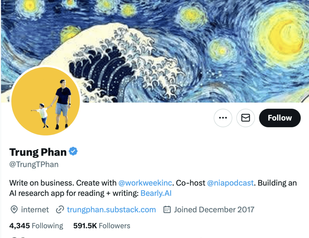
Trung is coming in strong with a solid yellow color that is striking and matches the artistic mashup in his bio.

He’s not selling hard with his profile or banner picture, but he is making great use of the fields he has to direct people where they can learn more about him

This is a great, somewhat understated approach for someone with multiple hustles. He is promoting his key value, two publications, a podcast AND a startup he is launching with a few but effective words.

Adding ‘internet’ to his location is a nice subtle signal that he’s an Internet-first global thinker.

Jeff Cannata

Jeff Cannata Twitter bio

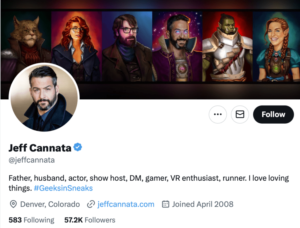
Jeff Cannata, podcaster and actor, is making the most of what looks like either some AI or graphic designed art. This biography conveys that Jeff is a passionate commentator on the entertainment industry, including large niche topics like gaming and VR.

Rhiannon Payne

Rhiannon Payne Twitter bio

Rhiannon is leveraging the classic social proof photo: speaking at a conference or prestigious event! She tells you exactly what kind of subjects you’ll hear about if you follow her and where you can find more from her. This is an example of an up-and-coming Twitter bio that is likely to attract tens of thousands more followers in the near future!

Let’s recap some points we’ve learned from these 10 inspirational Twitter accounts.

  • Use the characters you have wisely;
  • Emojis are little pictures and pictures can be worth a thousand words — but emojis only count as one character. Use them wisely!
  • Whether your banner is a photo, a call to action or an aesthetic graphical design — design your banner intentionally;
  • Convey who you are and be direct and inviting in your profile picture;
  • You can use the location field, the occupation field, and the URL field cleverly — and even hijack them a little bit to convey some other piece of information.

5 examples of creative Twitter bios

Yannick Veys

Yannick Veys Twitter Bio

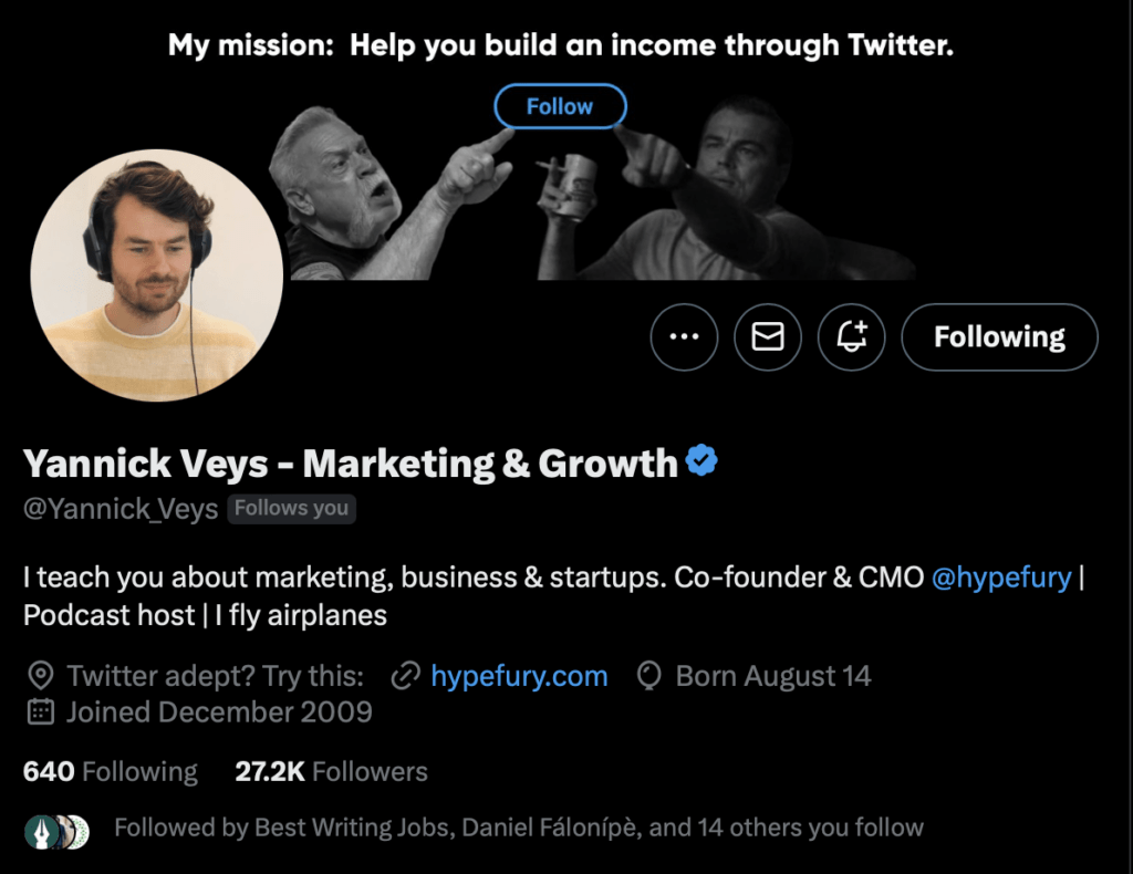
Ok, so this is biased because Yannick is the co-founder of Hypefury — but you have to admit, using a meme (or two memes mashed up) to point to the Follow button is an example of what we are trying to stress — creative use of banner and profile space!

His mission is also concise and placed at the top of the banner — it’s easy to understand what you will learn about by following Yannick.

John Cleese

John Cleese Twitter bio

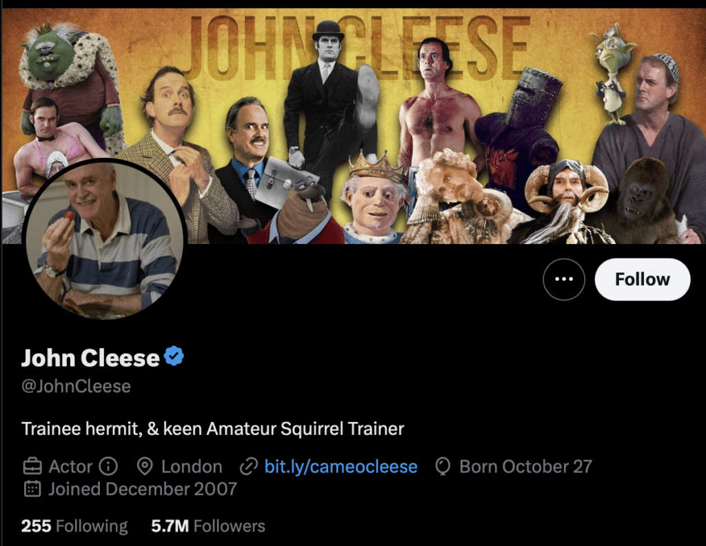
This isn’t your typical Twitter bio, and there’s not much going on in the textual section of the bio, except for a few self-deprecating self-descriptions. But the idea of a visual collage of this British comedic entertainer’s long history is a great way of saying a lot with the space available in the banner.

Notice that John Cleese is not just here to hang out and tweet his curmudgeonly thoughts in his golden years — he’s got a call to action, just like any great marketer, that directs you to consider booking a Cameo with him.

Replit

replit twitter bio

Replit is a platform for coding, collaboration, and learning. Its Twitter bio is great because it effectively communicates the essence of what the platform is and what it offers in just a few short sentences.

Clearly, Replit is a multi-million dollar VC-funded company — so they can afford to commission great visual designs like their eye-catching, brand-building banner. But with today’s AI tools, no matter your budget, you should be able to spend the time to come up with a banner that’s on par with what Replit is doing. Replit conveys a future-forward approach to coding and programming in a playful but intentional cartoon banner.

Anna Gát

Anna Gat Twitter bio

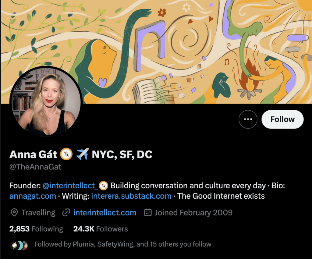
Anna Gát‘s profile shows another great use of the banner to convey a mood. She is providing a more intellectual take on writing about culture, life, the Internet and society — and building a community around it. The infamous plane emoji is used to convey a sense of global outlook and links within the bio invite you lo learn more about Anna and the Interintellect brand.

@SEOChatterBlog

SEO Chatter Twitter bio

Minimalistic color theory and contrast — yellow on black – makes the SEO Chatter account stand out. This is also an example of a quasi-“anon” account that is putting its value proposition front and center. SEO tips is what this account provides, and the theme of the account is built right into the name. This kind of anonymous, themed account is becoming more and more popular, with other prominent examples like CarDealershipGuy and The Wolf of Franchises.

These accounts lead with their theme — not a personal name or even a traditional corporate company name.

If you are working on growing within a very specific niche, and are building an audience and social media brand first, you may want to consider the creative approach of a themed anon account.

5 examples of hilarious Twitter bios

@pixelatedboat

pixelated boat Twitter bio

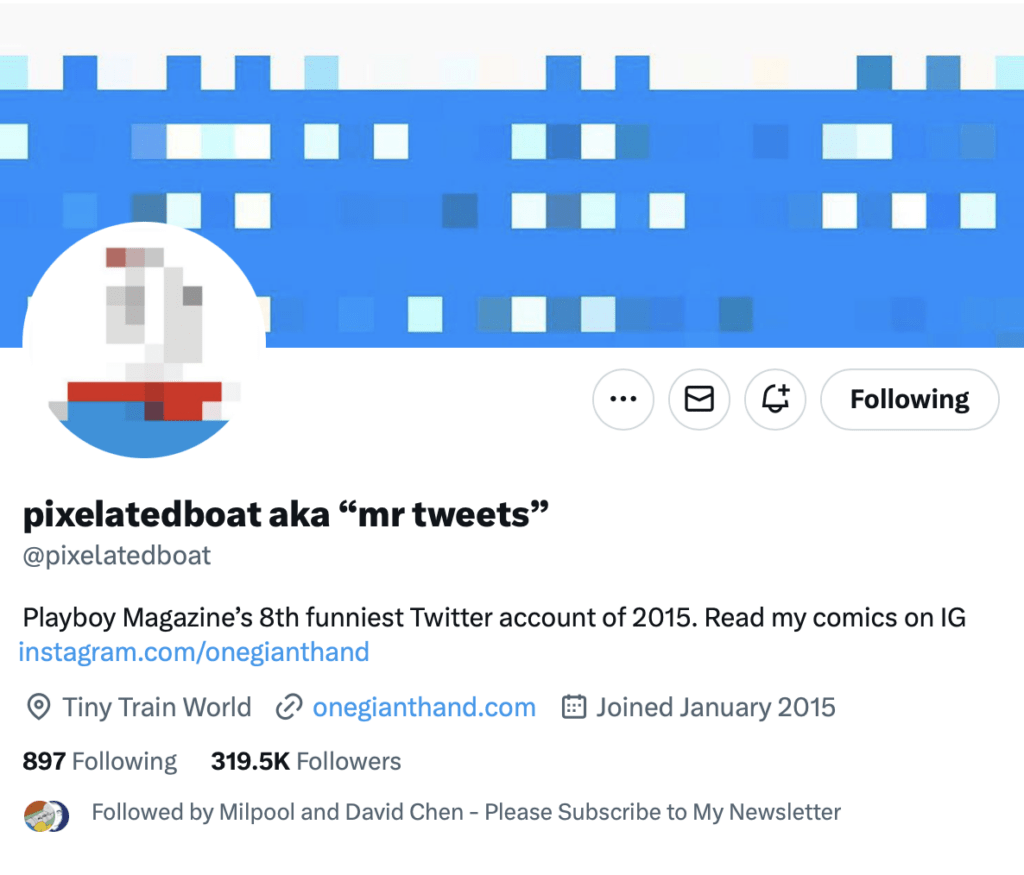
One of the most popular funny accounts on Twitter, @pixelatedboat has done something that works well for a lot of people: choosing a profile design avatar with a unique aesthetic and sticking with it for years and years. The bio might change, and the banner might even change, but @pixelatedboat’s pixelated boat avatar has been a stalwart recognizable Twitter icon for many, many years.

Nikita Bier

Nikita Bier Twitter Bio

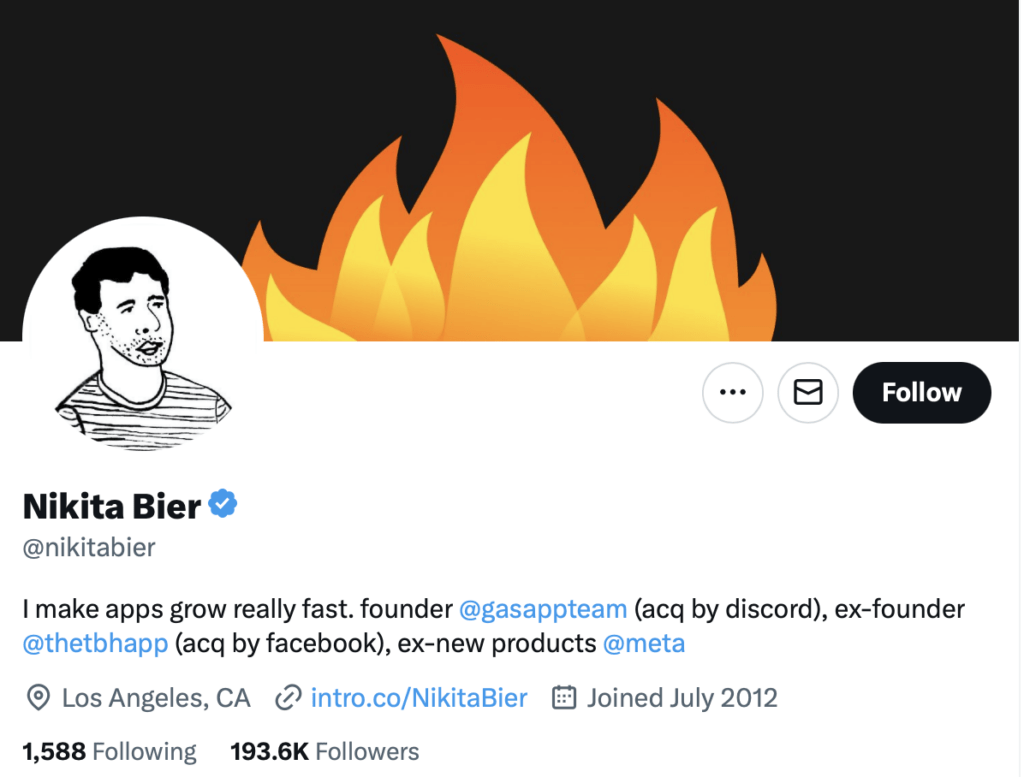
Nikita Bier has sold the same app to big social media companies — twice. Along the way, he has grown an audience with his hilarious, irreverent Twitter account that included an inside look at resting and vesting at Facebook, after Meta acquired his first app. Not many people would have the cojones to openly mock and satirize life at a big company that acquired them.

Nikita carved out a niche by being funny and authentic — but backed up his goofy persona by being a savvy and successful operator with multiple big exits.

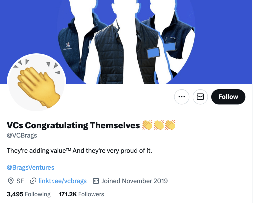
@VCBrags

Screenshot 2023 02 20 at 5.42.38 PM

VCBrags is what you would call an “anon” account. The brand is not really a company or a person but an anonymous, theme account that still provides value. In this case, VCs Congratulating Themselves shines a satirical light on the puffed arrogance and lack of self-awareness of many VCs on Twitter posting their Ws, bragging, signaling how awesome they are, and other generally annoying behaviors of venture capitalists.

@VCBrags is using the ubiquitous clap emoji as its profile pic (no need to pay an expensive designer for that one) and communicating a subtle in-joke by using its banner to make a statement/meme about faceless VCs is their signature Patagonia vests.

They have also used Linktree as their URL to allow people to go and navigate through multiple links. Linktree and similar services are a good way to direct people to multiple pages for your brand without taking up too much space in the Twitter bio.

Christopher Harris

Christopher Harris Twitter bio

Who is Christopher Harris?

Well, he’s not in tech or marketing, but he’s an influencer in education. This is a great example of how people in the public sector or industries that aren’t the stereotypical extremely online industries can still make a great bio that promotes their personal and professional interests.

Christopher uses the pointing emoji as a bulleted list, which is creative and pokes fun at people calling themselves “Thought Leaders” on Twitter. Yeah, we agree — let your work speak for itself, and maybe don’t use the term “Thought Leader” unless you are using it extremely ironically!

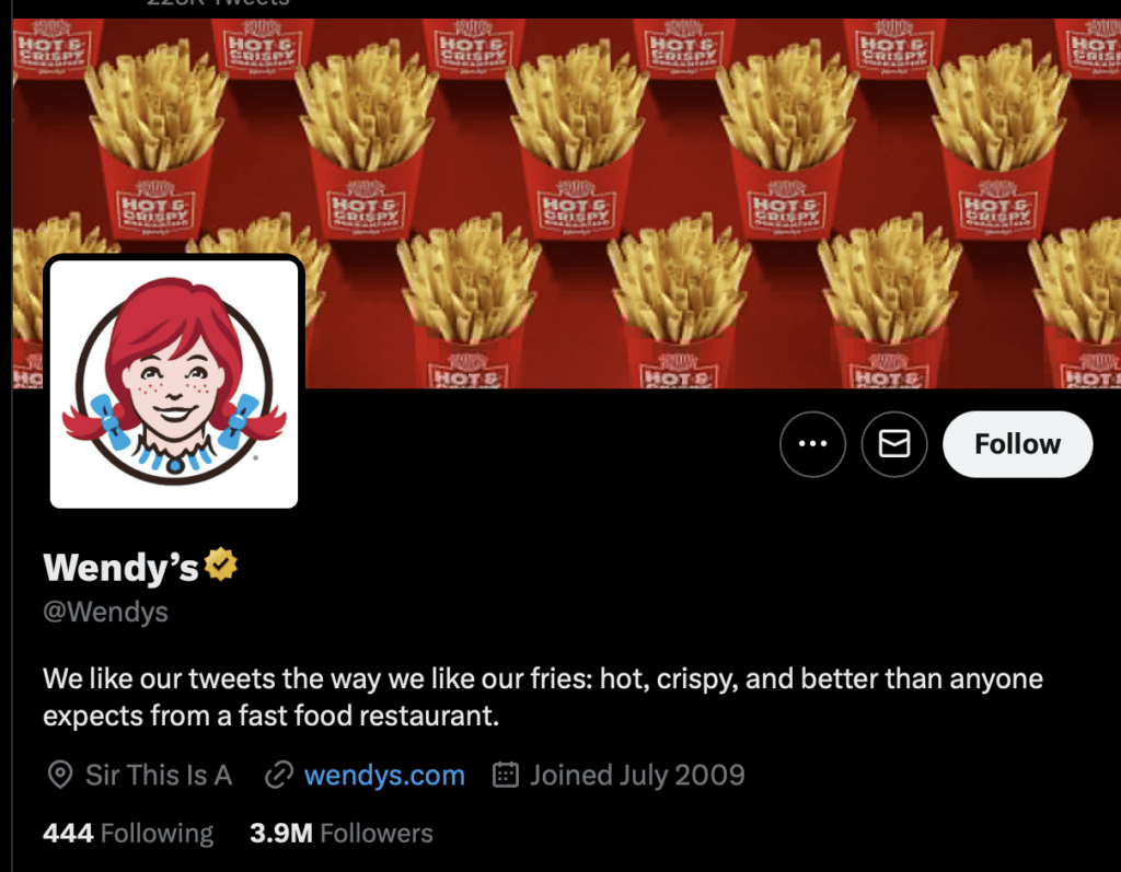
Wendy’s
Wendy's Twitter bio
Wendy’s Twitter bio

Most corporate Twitter accounts are super cringe, but Wendy’s is legitimately funny. They’re leaning in to the “Sir, this is a Wendy’s” meme format and putting their crispy fries front and center. Probably one of the only corporate Twitter accounts that actually seems to get Twitter, naturally and organically, and isn’t posting Gen Z memes and looking like Steve Buscemi in the “How do you do, fellow kids” meme.

Summary: Steps to writing a great Twitter Bio

To write an effective Twitter bio, follow these steps:

  1. Introduce yourself and describe your business, including your brand’s unique selling proposition (USP);
  2. Use all 160 characters to make your bio catchy and informative;
  3. Add disclaimers at the end of your bio and use amusing phrases or emojis;
  4. Display your brand’s personality and let followers know what to expect from your content;
  5. Use the right keywords to boost your brand’s visibility among your target audience;
  6. Share your achievements skillfully to provide social proof for your business;
  7. Add calls-to-action (CTAs) and links to other profiles to direct your followers to take specific actions and find your other products or services;
  8. Implement emojis to humanize your brand and add hashtags sparingly.

Remember to choose the words that best describe your business, cluster them to find the most relevant ones, and have fun writing an impactful Twitter bio! And for more info on what makes a great Twitter bios, check out this article too!

Ready to Grow Your Audience
& Make Money on Social?

Hypefury makes it easy to create, publish

and monetize your content across social media 

Join 3,500+ creators who are using HypeFury to earn online

Grow your audience on social media with Hypefury

Works with

Hypefury makes it easy to grow on on social media by proving you with the features that make it easy to create, distribute and monetize your content

Join 3,500+ creators who are using Hypefury to earn online

20 examples of great Twitter bios to get inspired by

Your Twitter bio is like your business card on the Internet. If you are a creator, you’ll want to learn more about how to optimize your most precious advertising billboard online — your bio.

Your Twitter bio is where thousands of people who could become prospective followers will make a split-second decision about whether you are worth following.

There are a couple of fundamental constraints you need to keep in mind:

First: You don’t have a lot of space, so you need to make it count.

Second: There are thousands of Twitter bios out there, so you need to find the right way to attract interest with just the right amount of originality.

A solid Twitter bio is one of the fundamental foundations for running effective Twitter marketing.

It seems like it should be easy, right? Say who you are, and what you do, get a nice headshot and design a banner image.

In essence, that’s the canvas you have to paint with, but there’s an art to it!

Table of Contents

What makes a good Twitter bio

A Twitter bio is like a modern resume or CV for the social media era. You have 160 characters to convey who you are, what you do, and why people should follow you.

160 characters is not a lot, so you must make the most of it — with short URLs, emojis and creative approaches to using the allotted character limit to its fullest.

Here’s @levelsio, a famous indie solopreneur, making the most of the character limit:

pieter levels

You can see that he is maximizing the character limit by listing a series of projects. As part of his personal style, he’s not using the banner to be particularly serious, but conveying a meme-friendly, indie attitude.

Let’s take a look at another Twitter bio:

Steph smith twitter bio

This a similar approach but with some more tweaks. Steph Smith is also using the character space wisely, with emojis and line spacing that allow her to show off her various main gigs and side hustles.

She’s also cleverly using a technique that is popular with indie makers and people who build in public: the revenue progress bar.

This is a clever example of how an economical use of the characters available can still convey interesting information. Steph has hijacked the “location” field to convey a different kind of information than just “California” or “Bali.” Creativity wins here!

Let’s look at one more:

Justin welsh twitter bio

This is a more classic and direct approach — Justin Welsh tells you exactly what he does, displays social proof without being cheesy, and provides a clear profile headshot and unambiguous call to action in the banner.

Justin is less concerned with providing a jumping-off point or “link tree” for a series of projects and has an approach that is focused on bringing you in to his audience.

There is no one right way to do this — the only commonality that matters is to design with intention.

Whether you want to build emoji-driven graphical candy, or just get straight to the point with plain text — it all depends on what you are going for.

10 examples of inspirational Twitter bios

Let’s take a look at Twitter bios that are aiming for an inspirational approach — bios that communicate that the act of following these Twitter accounts will bring followers more motivational and authoritative tweets into the timeline.

Tony Robbins

Tony Robbins Twitter bio

OK, so this first one is kind of cheating a bit. We picked the global public figure literally most known for self-promotion, inspirational marketing — someone who literally built a billion-dollar company off of a personal brand.

But notice that Tony is still using some of the same tips and techniques: accentuate text with emojis, tell people exactly what you do, use social proof, and be direct (and not overcrowded) with your banner.

Guy Kawasaki

Guy Kawasaki twitter bio

Guy Kawasaki has had an illustrious career, including working on the Apple Macintosh marketing team in the ’80s. In fact, I think what’s interesting here is what Guy is not doing!

He’s not trying to pack his entire bio into the space that he has. This is a great example of letting a high-quality, minimalistic banner design do the talking.

Guy is associated with a big Australian unicorn company, Canva, and has a weekly podcast he wants you to check out. It’s clear, simple, and makes you curious to learn more.

Andrew Huberman

Andrew huberman twitter bio

Dr. Huberman has an ace up his sleeve. Any time you can break out the Ivy League or FAANG credentials (or in this case, a PhD from Stanford), you are automatically dialed in with social proof. Andrew’s bio hits three points with concision and clarity of purpose.

Why should you follow me? I have the authority — I’m a Stanford professor.

What do I do? I host a podcast that you should listen to.

Why should you listen to it? To learn more about cutting-edge science and health information.

Codie Sanchez

Codie Sanchez Twitter bio

Codie Sanchez isn’t just a generic investor. VCs and angels (and wannabe VCs and angels) are a dime a dozen on Twitter. Codie invests in boring businesses.

She shares a magnanimous vision statement. You may not know exactly what “boring businesses” means — but it has got your curiosity that this is someone who will dive into businesses that are slightly outside of the typical Silicon Valley hype.

The banner reinforces that this might just be the first person to follow if the mainstream Valley perspective on what makes a good business is getting tiresome. Codie promises to talk about different kinds of businesses — maybe enough to inspire you to start one.

Alex Hormozi

Alex Hormozi Twitter bio

OK, including a 5-star rating emoji art is kind of funny, but it’s an example of using emojis to cleverly convey a positive connotation. Alex, like some we have seen before, takes a direct approach and tells you exactly what he does and where you need to go to find more from him (Acquisition.com).

He is extremely precise in specifying what kind of business advice/mentorship he is giving. It’s not a generalized guru stuff — it’s more precise: growth and M&A advice for profitable multi-million dollar companies.

He’s using the link field to drive people to his book, and previewing with his location field that the book won’t cost much (just a buck).

Ana Lorena Fabrega

Ana Lorena Fabrega Twitter bio

Ana is a great example of putting some specific effort into combining photography and graphic design for the bio.

It’s clear after a quick read that Ana is an influencer in the education field and anyone interested in education can check out Synthesis School or order her book.

The strength here is the banner that says a lot without being too crowded, and displays a solid design aesthetic for her brand and her book.

Trung Phan

Trung Phan Twitter bio

Trung is coming in strong with a solid yellow color that is striking and matches the artistic mashup in his bio.

He’s not selling hard with his profile or banner picture, but he is making great use of the fields he has to direct people where they can learn more about him

This is a great, somewhat understated approach for someone with multiple hustles. He is promoting his key value, two publications, a podcast AND a startup he is launching with a few but effective words.

Adding ‘internet’ to his location is a nice subtle signal that he’s an Internet-first global thinker.

Jeff Cannata

Jeff Cannata Twitter bio

Jeff Cannata, podcaster and actor, is making the most of what looks like either some AI or graphic designed art. This biography conveys that Jeff is a passionate commentator on the entertainment industry, including large niche topics like gaming and VR.

Rhiannon Payne

Rhiannon Payne Twitter bio

Rhiannon is leveraging the classic social proof photo: speaking at a conference or prestigious event! She tells you exactly what kind of subjects you’ll hear about if you follow her and where you can find more from her. This is an example of an up-and-coming Twitter bio that is likely to attract tens of thousands more followers in the near future!

Let’s recap some points we’ve learned from these 10 inspirational Twitter accounts.

  • Use the characters you have wisely;
  • Emojis are little pictures and pictures can be worth a thousand words — but emojis only count as one character. Use them wisely!
  • Whether your banner is a photo, a call to action or an aesthetic graphical design — design your banner intentionally;
  • Convey who you are and be direct and inviting in your profile picture;
  • You can use the location field, the occupation field, and the URL field cleverly — and even hijack them a little bit to convey some other piece of information.

5 examples of creative Twitter bios

Yannick Veys

Yannick Veys Twitter Bio

Ok, so this is biased because Yannick is the co-founder of Hypefury — but you have to admit, using a meme (or two memes mashed up) to point to the Follow button is an example of what we are trying to stress — creative use of banner and profile space!

His mission is also concise and placed at the top of the banner — it’s easy to understand what you will learn about by following Yannick.

John Cleese

John Cleese Twitter bio

This isn’t your typical Twitter bio, and there’s not much going on in the textual section of the bio, except for a few self-deprecating self-descriptions. But the idea of a visual collage of this British comedic entertainer’s long history is a great way of saying a lot with the space available in the banner.

Notice that John Cleese is not just here to hang out and tweet his curmudgeonly thoughts in his golden years — he’s got a call to action, just like any great marketer, that directs you to consider booking a Cameo with him.

Replit

replit twitter bio

Replit is a platform for coding, collaboration, and learning. Its Twitter bio is great because it effectively communicates the essence of what the platform is and what it offers in just a few short sentences.

Clearly, Replit is a multi-million dollar VC-funded company — so they can afford to commission great visual designs like their eye-catching, brand-building banner. But with today’s AI tools, no matter your budget, you should be able to spend the time to come up with a banner that’s on par with what Replit is doing. Replit conveys a future-forward approach to coding and programming in a playful but intentional cartoon banner.

Anna Gát

Anna Gat Twitter bio

Anna Gát‘s profile shows another great use of the banner to convey a mood. She is providing a more intellectual take on writing about culture, life, the Internet and society — and building a community around it. The infamous plane emoji is used to convey a sense of global outlook and links within the bio invite you lo learn more about Anna and the Interintellect brand.

@SEOChatterBlog

SEO Chatter Twitter bio

Minimalistic color theory and contrast — yellow on black – makes the SEO Chatter account stand out. This is also an example of a quasi-“anon” account that is putting its value proposition front and center. SEO tips is what this account provides, and the theme of the account is built right into the name. This kind of anonymous, themed account is becoming more and more popular, with other prominent examples like CarDealershipGuy and The Wolf of Franchises.

These accounts lead with their theme — not a personal name or even a traditional corporate company name.

If you are working on growing within a very specific niche, and are building an audience and social media brand first, you may want to consider the creative approach of a themed anon account.

5 examples of hilarious Twitter bios

@pixelatedboat

pixelated boat Twitter bio

One of the most popular funny accounts on Twitter, @pixelatedboat has done something that works well for a lot of people: choosing a profile design avatar with a unique aesthetic and sticking with it for years and years. The bio might change, and the banner might even change, but @pixelatedboat’s pixelated boat avatar has been a stalwart recognizable Twitter icon for many, many years.

Nikita Bier

Nikita Bier Twitter Bio

Nikita Bier has sold the same app to big social media companies — twice. Along the way, he has grown an audience with his hilarious, irreverent Twitter account that included an inside look at resting and vesting at Facebook, after Meta acquired his first app. Not many people would have the cojones to openly mock and satirize life at a big company that acquired them.

Nikita carved out a niche by being funny and authentic — but backed up his goofy persona by being a savvy and successful operator with multiple big exits.

@VCBrags

Screenshot 2023 02 20 at 5.42.38 PM

VCBrags is what you would call an “anon” account. The brand is not really a company or a person but an anonymous, theme account that still provides value. In this case, VCs Congratulating Themselves shines a satirical light on the puffed arrogance and lack of self-awareness of many VCs on Twitter posting their Ws, bragging, signaling how awesome they are, and other generally annoying behaviors of venture capitalists.

@VCBrags is using the ubiquitous clap emoji as its profile pic (no need to pay an expensive designer for that one) and communicating a subtle in-joke by using its banner to make a statement/meme about faceless VCs is their signature Patagonia vests.

They have also used Linktree as their URL to allow people to go and navigate through multiple links. Linktree and similar services are a good way to direct people to multiple pages for your brand without taking up too much space in the Twitter bio.

Christopher Harris

Christopher Harris Twitter bio

Who is Christopher Harris?

Well, he’s not in tech or marketing, but he’s an influencer in education. This is a great example of how people in the public sector or industries that aren’t the stereotypical extremely online industries can still make a great bio that promotes their personal and professional interests.

Christopher uses the pointing emoji as a bulleted list, which is creative and pokes fun at people calling themselves “Thought Leaders” on Twitter. Yeah, we agree — let your work speak for itself, and maybe don’t use the term “Thought Leader” unless you are using it extremely ironically!

Wendy’s

Wendy's Twitter bio
Wendy’s Twitter bio

Most corporate Twitter accounts are super cringe, but Wendy’s is legitimately funny. They’re leaning in to the “Sir, this is a Wendy’s” meme format and putting their crispy fries front and center. Probably one of the only corporate Twitter accounts that actually seems to get Twitter, naturally and organically, and isn’t posting Gen Z memes and looking like Steve Buscemi in the “How do you do, fellow kids” meme.

Summary: Steps to writing a great Twitter Bio

To write an effective Twitter bio, follow these steps:

  1. Introduce yourself and describe your business, including your brand’s unique selling proposition (USP);
  2. Use all 160 characters to make your bio catchy and informative;
  3. Add disclaimers at the end of your bio and use amusing phrases or emojis;
  4. Display your brand’s personality and let followers know what to expect from your content;
  5. Use the right keywords to boost your brand’s visibility among your target audience;
  6. Share your achievements skillfully to provide social proof for your business;
  7. Add calls-to-action (CTAs) and links to other profiles to direct your followers to take specific actions and find your other products or services;
  8. Implement emojis to humanize your brand and add hashtags sparingly.

Remember to choose the words that best describe your business, cluster them to find the most relevant ones, and have fun writing an impactful Twitter bio! And for more info on what makes a great Twitter bios, check out this article too!
Ready to Grow Your Audience
& Make Money on Social?

Hypefury makes it easy to create, publish

and monetize your content across social media 

Join 3,500+ creators who are using HypeFury to earn online

You might also like